


The Affordable Health Care Act was looming and about to change everything.
Healthcare insurance companies would have to compete on the online marketplaces, where it would be clear that their offerings were largely commoditized - and that their brands would play a much larger role than ever before.
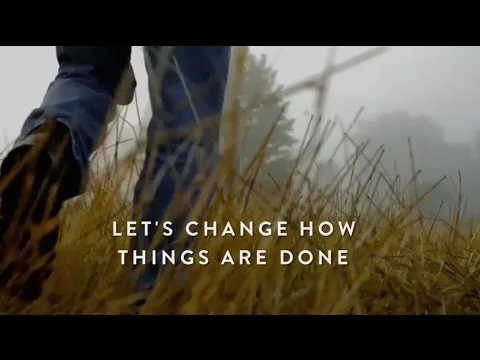
Humana needed to stake out a well-defined, ownable and distinctive territory on an unchartered new landscape.
The “Peoplecare” platform I created did precisely that. It aligned Humana’s core truths with the market’s new realities, and repositioned the brand for the new era of affordable health care.
It also immediately organized and informed how everything should work. From re-validating and re-framing many of Humana’s internal initiatives and processes, to how it should embrace technology, to how the brand communications should look and feel, to the relationship you have with your doctor.
Everything the brand would do from now on would in some way be "Closing the gap between People and Care".
As a consultant, I didn’t get to oversee or collaborate on the final production of the work. I don’t believe the icons were ever fully realized as the vital element of the platform that they are…or were.
Regardless, I was proud to have taken part, in some small way, in what may be the single most important change our generations will see.
And I'm still in love with the reductive beauty and new language of those “icon/photograph” posters, darn it…